"Our sense organs can function only by means of comparisons. The eye accepts a line as long when a shorter line is presented for comparison. The same line is taken as short when the line compared with it is longer. Colour effects are similarly intensified or weakened by contrasts." Itten The Elements of Color, p. 32

Itten's 7 kinds of colour contrast:
1. Contrast of hue
2. Light-dark contrast
3. Cold-warm contrast
4.Complementary contrast
5.Simultaneous contrast
6. Contrast of saturation
7. Contrast of extension

With this Synesthesia series of work, I am working with one hue/colour at a time, defined as a monochromatic colour scheme. It means I am not able to use #1. Contrast of hue. For each individual work to be successful I need to work with other colour properties to achieve contrast.

The Synesthesia series aims to show how I feel about each colour's energy. To express that energy I focus on line, without making a thing, shape or motif and I work with value. #2 Light-dark contrast is my main design tool

# 2. Light-dark contrast. Here I have overlapped with an off-set, dark to light threads over a dark to light ground.

To me, this colour evokes calmness, an immensity in its calmness. To give this feeling I need to show a low level of contrast but still need to have some contrasting elements for the work to be successful, otherwise, there is no energy at work.
I took advantage of one of textiles' strongest features - texture. This low contrast dark to light fabric line up is still interesting to the eye because each fabric has a different texture.
These fabrics also show #6 Contrast of saturation at a low level but the eye can still see a brighter blue beside a dull blue.

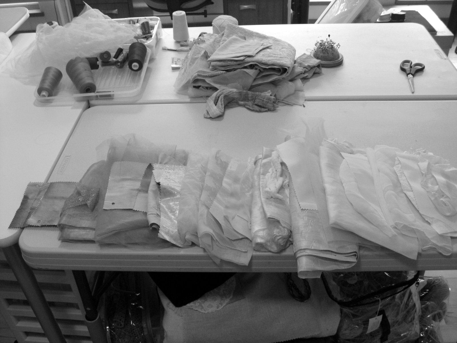
When checking for #2 Light-dark contrast I look through a 'Ruby-Beholder' - a red or green plastic strip and or I take a picture with my camera to get a black and white image.
Here I decided there was just enough contrast of light and dark for the eye/brain to notice while still giving off a calm vibe.

Including too wide a range of light to dark generally is not successful. One needs to limit the range of values to a group or block along the light-dark continuum.
When I am designing a work I take out all of the fabrics I have that would be suitable as far as their other characteristics are concerned. I arrange them in a continuous line from light to dark. I then look along the line to decide which section would best express the feel and energy of that colour. I work with fabrics in that section and put away those either side of the chosen ones.

I am making colour cards to go with each Synesthesia work. The cards have strips of fabric glued to them. When I select the fabrics I aim for the maximum range of values, saturation, and cold-warm contrast because the purpose of the cards is to show the full range of the colour's properties.

A stop for a quick dark-light check during construction.
Is there enough contrast to effectively express the energy I feel from this colour?
When I make work I do a lot of research and pre-planning in a sketchbook. Next, I sample with the actual fabrics. When I am actually making the work it feels as though I am back at the trial and error stage but this time I am working towards producing that image or feeling I have of what the work should be and it guides my decisions.